
|
|
|
 TXDBGrid and TXDBColumn, TXDBEditor, TXDBNavigator components TXDBColumns and TXDBPrintColumns components Gradient controls  |
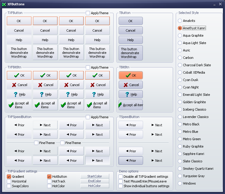
Gradient ControlsGradient buttons:
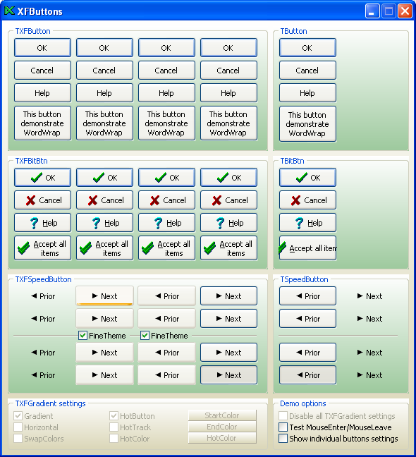
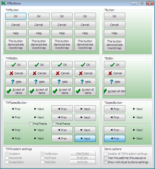
TXFButton is a gradient push button control. TXFButton is derrived from the standard TButton control.
TXFButton introduces several properties to control border and gradient style.
TXFBitBtn is a gradient bitmap button control. TXFBitBtn is derrived from the standard TBitBtn control.
TXFBitBtn introduces several properties to control border and gradient style.
TXFSpeedButton is a gradient button control. TXFSpeedButton is derrived from the standard TSpeedButton control. TXFSpeedButton introduces several properties to control border and gradient style.
TXFUpDown is a gradient up-down control. TXFUpDown is similar to the standard TUpDown control,
but introduces several properties to control border and gradient style. Transparent controls:
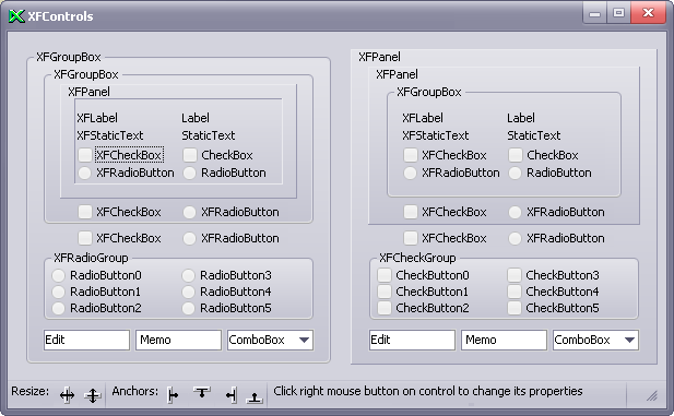
TXFLabel is a nonwindowed control that displays text on a gradient background. TXFLabel is derrived from
the standard TLabel control, but Transparent property is default True.
TXFStaticText is a windowed control that displays text on a gradient background. TXFStaticText is similar to the standard TStaticText control, but Transparent property works effective on a gradient background.
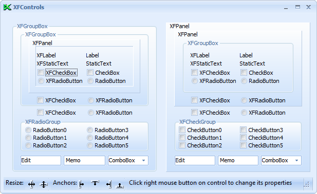
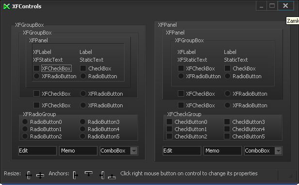
TXFCheckBox represents a transparent check box. TXFCheckBox is similar to the standard TCheckBox control,
but works effecive on gradient background.
TXFRadioButton represents a transparent radio button. TXFRadioButton is similar to the standard
TRadioButton control, but works effecive on gradient background. Gradient panels:
TXFGroupBox represents a gradient group box. TXFGroupBox is similar to the standard TGroupBox control, but introduces several properties to control gradient style and parent's background.
TXFRadioGroup represents a gradient group of radio buttons that function together. TXFRadioGroup is similar to the standard TRadioGroup control, but introduces several properties to control gradient style and parent's background.
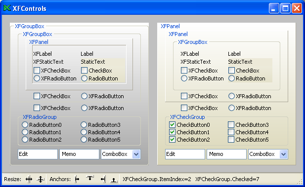
TXFCheckGroup represents a gradient group of check buttons that function together. TXFCheckGroup is similar to the TRadioGroup control, but introduces Checked property to maintain state of check buttons and several properties to control gradient style and parent's background.
TXFPanel represents a gradient panel. TXFPanel is similar to the standard TPanel control, but introduces
several properties to control gradient style and parent's background. Gradient bars:
TXFStatusBar represents a gradient status bar. TXFStatusBar is similar to the standard TStatusBar control,
but introduces several properties to control gradient style.
TXFTrackBar represents a gradient track bar. TXFTrackBar is similar to the standard TTrackBar control,
but introduces several properties to control gradient style.
TXFProgressBar represents a gradient progress bar. TXFProgressBar is similar to the standard TProgressBar control, but introduces several properties to control gradient style. DB-Aware controls:
TXDBText represents a data-aware control that displays the value of a field on a gradient background. TXDBText is derrived from the standard TDBText control, but Transparent property is default True.
TXDBCheckBox represents a data-aware transparent check box. TXDBCheckBox is derived from the standard
TDBCheckBox control, but works effecive on gradient background.
TXDBRadioGroup represents a gradient group of radio buttons connected to a database. TXDBRadioGroup is similar to the standard TDBRadioGroup control, but introduces several properties to control gradient style and parent's background. Go to the top of this page GalleryBelow they are located some screenshots of the demo applications included in all packages. Click on selected screenshot to see its bigger version.
Copyright © 1999-2024 X-Files Software
|
||||||||||||||||||||||||||||||||||||


 |